The Gutenberg Layout Problem
29 October 2019
The Gutenberg editor is amazing. It allows for flexibility that was previously unheard of without a dedicated page builder. And though everyone kept saying “Gutenberg is not a page-builder”, I think there’s no denying it. It is a page-builder. You can call it an immersive editing experience for all I care, but the truth is it’s a page-builder.
With all the good things it brought, there were (and still are) some difficulties, mostly regarding the way we can style things - both in the editor and the frontend. This post is about one of the many solutions that you can implement, depending on your layouts.
If your theme doesn’t have a sidebar and instead the content is the whole viewport-width, then things are pretty simple. In the Gridd theme however there is no standard layout. Users build their own grid. A site may be just a logo on the top and then the content, or it can have 4 widget-areas on the sides. And therein lies the problem:
How can we account for ALL cases?
What Gutenberg generates
I created a dummy post with all the cases I could think of at the time, so this is what we’ll try to accomplish:
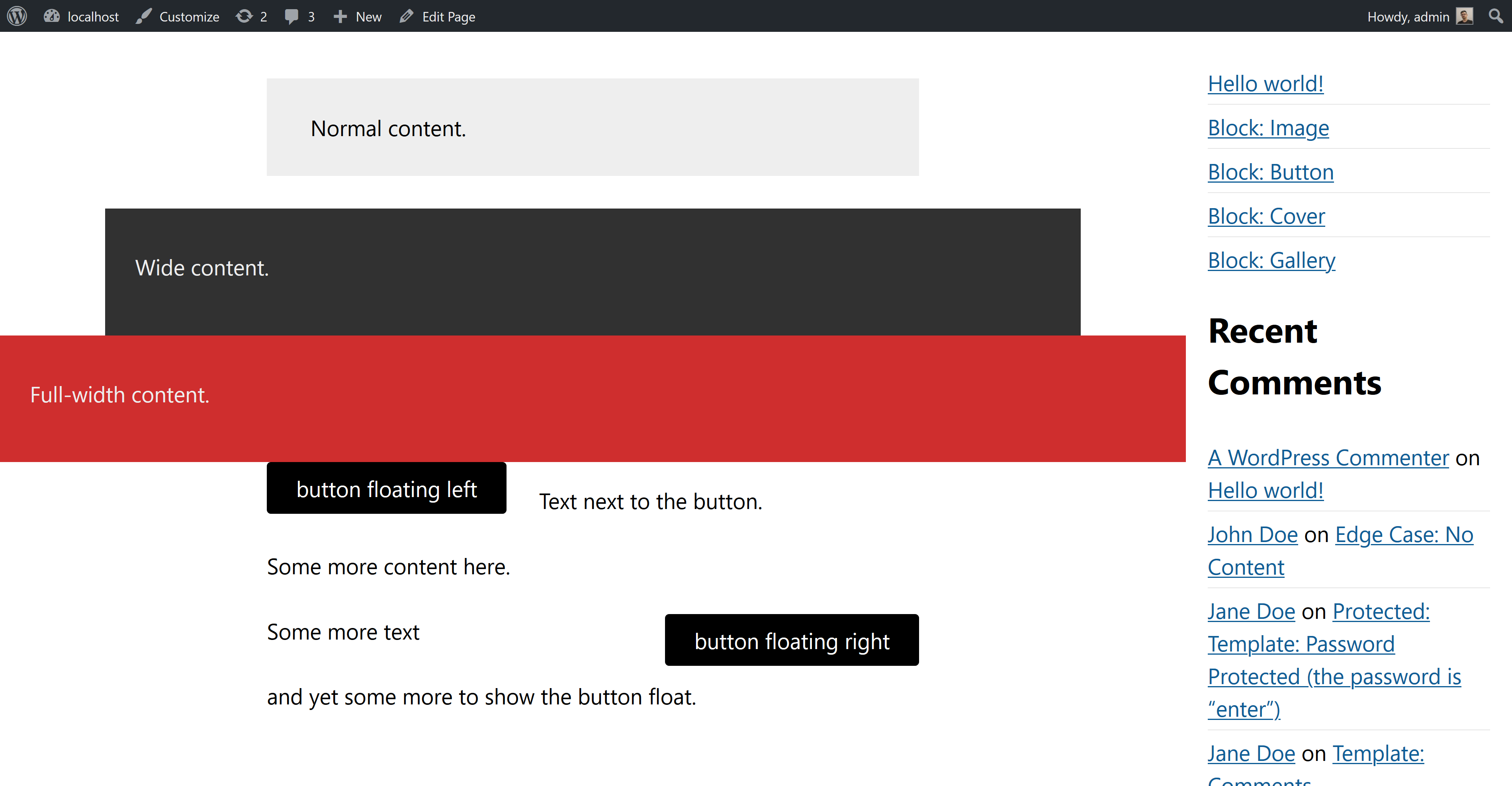
First of all we have the Gutenberg-generated HTML:
<div class="my-container">
  <div class="entry-content container">
      <p class="has-background has-very-light-gray-background-color">Normal content.</p>
      <div class="wp-block-group alignwide has-very-dark-gray-background-color has-background">
          <div class="wp-block-group__inner-container">
              <p class="has-text-color has-very-light-gray-color">Wide content.</p>
          </div>
      </div>
      <div class="wp-block-group alignfull has-vivid-red-background-color has-background">
          <div class="wp-block-group__inner-container">
              <p class="has-text-color has-very-light-gray-color">Full-width content.</p>
          </div>
      </div>
      <div class="wp-block-button alignleft">
          <a class="wp-block-button__link">button floating left</a>
      </div>
      <p>Text next to the button.</p>
      <p>Some more content here.</p>
      <div class="wp-block-button alignright">
          <a class="wp-block-button__link">button floating right</a>
      </div>
      <p>Some more text</p>
      <p>and yet some more to show the button float.</p>
  </div>
</div>
The wrapping my-container element there is just our theme’s wrapper for the content.
Styling
In the code above we can see a lot of classes, most of them color-related. I added them when editing the post to make it clear in the screenshot what each element is and what its dimensions are. But here are the important ones and what they should do:
.alignwidemakes an element wider than the normal content..alignfullmakes an element span the full width of its parent container..alignleftfloats an element to the left - while still keeping it inside the constraints of the “regular” content’s width.alignright- similar to.alignleft, but obviously floating on the right side.
What we need to accomplish:
- We want our normal content to have a maximum width of
50em. - Elements that have the
.alignwideclass should be 25% wider than normal content. - Elements with the
alignfullclass should be 100% of their container. - We also want a padding on 1em on the left & right of our elements, otherwise on mobile they’re going to stick to the edges of the window.
Let’s start by defining some variables, and add the padding to our container:
.my-container {
    --padding: 1em;
    --content-width: 50em;
    --wide-diff: 25%;
    --wide-width: calc(var(--content-width) * 1.25);

    padding: 0 var(--padding) 0 var(--padding);
}
Normal elements
Next up, we can start adding styles for elements that should have a normal width:
.entry-content > :not(.alignfull):not(.alignwide):not(.alignleft):not(.alignright) {
  max-width: var(--content-width);
  margin-left: auto;
  margin-right: auto;
}
The above is fairly simply: For all elements that are direct children of our main container, if they are not alignfull/alignwide/alignleft/alignright we’re adding our content-width css-variable as the element’s maximum width. Once we do that, we notice that the element is on the left of the screen, so we’re adding the margin-left and margin-right lines and set them to auto. This way our element gets properly centered.
.alignwide elements
Moving on to the “wide” elements:
.entry-content .alignwide {
  width: calc(var(--content-width) + var(--wide-diff) + 2 * var(--padding));
  max-width: 100%;
  margin-left: auto;
  margin-right: auto;
}
This here is a bit more complicated: To calculate the width of our element we’re adding the --wide-diff var to our content-width, and then we also add the padding (doubled since it exists both on the left and right of our container).
.alignfull elements
The “full” elements are not without their difficulties too:
.entry-content .alignfull {
  transform: translateX(calc(0px - var(--padding)));
  width: calc(100% + 2 * var(--padding));
  max-width: calc(100% + 2 * var(--padding));
  margin-left: auto;
  margin-right: auto;
}
For these ones we have to move the element to the left by the amount of our defined padding, and then set its width to be equal to 100% of our available space, plus the padding doubled so there’s no space on the left and right.
.alignleft & .alignright elements
Now that we’re done with the basics let’s move on to the hard part: Getting the floats right.
By default these are not restricted by the 50em we want for our content since they use float. As a result they will literally float to the edges of the screen. Well, not quite the edge, 1em from the edge ‘cause that’s the padding we have defined. So how do we get them to be within the limits of our invisible and theoretical “normal content” box?
The best solution I could come up with so far is this:
.entry-content .alignleft {
  float: left;
  margin-left: calc(50% - var(--content-width) / 2);
}

.entry-content .alignright {
  float: right;
  margin-right: calc(50% - var(--content-width) / 2)
}
The above snippet will add a left margin to elements that are floated to the left and a right margin to elements floated to the right, therefore displacing them visually and moving them to the place we need the to be. It’s counter-intuitive and I absolutely hate it. It’s an ugly hack that makes absolutely no sense. But it works (most of the time).
Got a better idea?
How do you handle this? Do you have a better idea? If you do, please let me know. I’ve been banging my head against the wall for a long time trying to find an elegant solution.
Comments
No comments found for this article. Comments posted before 2019-09-15 are no longer available due to a system migration since I no longer use Disqus for comments.
Join the discussion for this article on this ticket. Comments appear on this page instantly.